Are you sure?
For those time where you don't want the user to delete elements by mistake but don't want to bother him/her with a modal neither.
What are we building?
A bit more context.
Usage.
<delete
    :url="/api/resource/1"
    @delete="deleteResource(1)"
></delete>
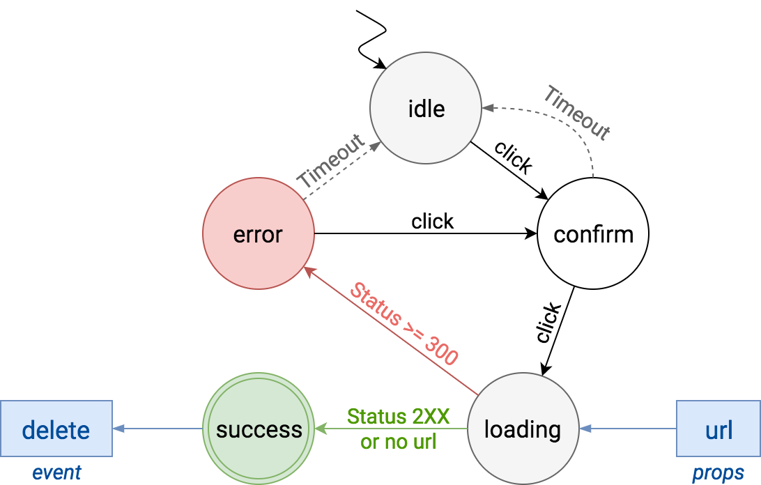
One component, five states.
The code necessary to display those states based on a status data field is pretty straightforward. We design a message and a close icon (with fontawesome) inside a flex container. We show them and style them conditionally based on the status. We define some computed properties to make our code cleaner and some props to allow parent components to customize the texts. All of this in a single file component that I called Delete.vue.
Note that I am using boostrap 4 and its utility classes. See you in the code!
<template>
    <!--
        Flex container:
        Wrapper that contains and positions the message and the close icon.
    -->
    <div class="d-flex justify-content-end align-items-center">

        <!--
            Message:
            The text we show the user, its color and whether we show it or not depend on the status.
            This is calculated inside computed properties below.
        -->
        <span
            v-if="showMessage"
            v-text="message"
            class="mr-1"
            :class="messageClass"
        ></span>

        <!--
            Close icon:
            We always show the icon unless the element has been successfully deleted.
            We make it spin when loading.
            We make it red when not idle.
        -->
        <i
            v-show="status !== 'success'"
            class="fa fa-close"
            :class="{'fa-spin': status === 'loading', red: status !== 'idle'}"
        ></i>
    </div>
</template>

<script>
export default {
    // Optional props to allow parent components to customize the texts.
    props: {
        confirmText: { type: String, default: "Are you sure?" },
        successText: { type: String, default: "Deleted" },
        errorText: { type: String, default: "Something went wrong!" },
    },

    // Keep track of the current status of the component.
    data() {
        return {
            status: 'idle',
        }
    },

    computed: {
        // We show a message on states: `confirm`, `success` or `error`.
        showMessage() {
            return ['confirm', 'success', 'error'].includes(this.status);
        },

        // Dynamically retrieve the text from the props.
        message() {
            return this[this.status + 'Text'] || '';
        },

        // The message text is gray on `confirm` state, red otherwise.
        messageClass() {
            return this.status === 'confirm' ? 'text-muted' : 'text-danger';
        }
    }
}
</script>

<style>
    /* Some styling for the close icon */
    .fa { cursor: pointer; color: #aaa; }
    .fa:hover { color: #555; }
    .fa.red { color: #CC0044; }
    .fa.red:hover { color: #AA0022; }
</style>
Interactions between states
Now that we have a design that dynamically change when the status updates, we need to define how we want those states to interact together.

Initial state
Initial state is idle. But you know that.
data() {
    return {
        status: 'idle',
    }
},
Clicks
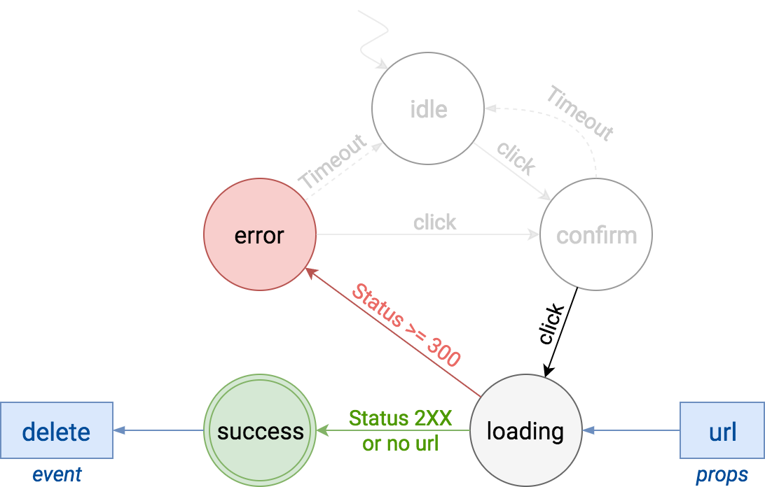
Clicking on the close icon brings us to the confirm state and clicking again in the loading state. Also we can start again if we had an error.

<!-- Close icon: New event listener on click. -->
<i
    v-show="status !== 'success'"
    class="fa fa-close"
    :class="{'fa-spin': status === 'loading', red: status !== 'idle'}"
    @click="click"
></i>
methods: {
    click() {
        switch (this.status) {
            case 'idle':
            case 'error':
                this.status = 'confirm';
                break;
            case 'confirm':
                this.status = 'loading';
                this.submit();
                break;
        }
    },
}
Submitting
As you can see in the click() method above, when we reach the the loading state we also submit our request to delete the item. We will accept the delete endpoint as an url prop. If no url is given, we assume we are deleting an item which as not been persisted (yet) and therefore we simply succeed.

props: {
    // ...
    url: String,
},

methods: {
    // ...
    submit() {
        if (! this.url) {
            return this.onSuccess();
        }

        axios.delete(this.url)
            .then(this.onSuccess)
            .catch(this.onError);
    },
}
The onSuccess and onError methods update the status of the component accordingly. However when we succeed, we also need to notify the parent component by emitting a delete event. At this point, we wait half a second before emitting the event otherwise the element will disappear before we have time to show our success state to the user. Finally, we make this deleteDelay configurable by accepting it as a prop.
props: {
    // ...
    deleteDelay: { type: Number, default: 500 },
},

methods: {
    // ...
    onSuccess() {
        this.status = 'success';
        setTimeout(() => {
            this.$emit('delete');
        }, this.deleteDelay);
    },

    onError() {
        this.status = 'error';
    },
}
Timeouts
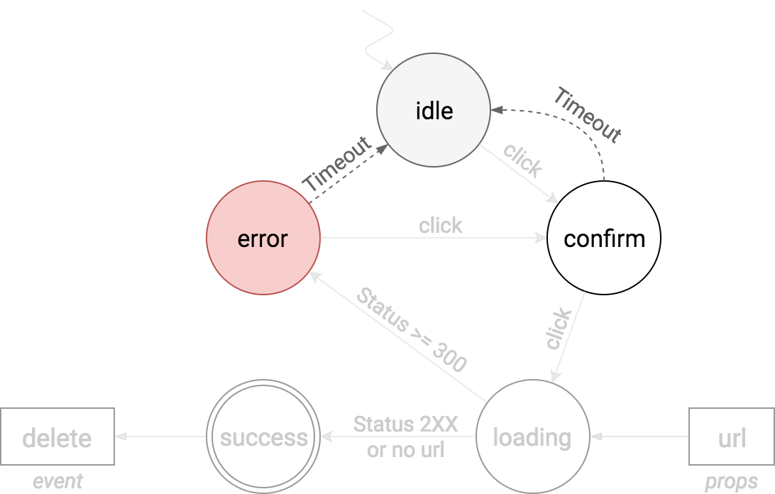
The last thing we haven't talked about in the state diagram is the status timeout. Namely, If we wait too long then a confirm status or an error status will go back to an idle status.

A naive approach would be:
setTimeout(() => { this.status = 'idle'; }, 3000);
The problem with that is that if you happen to manipulate the component within those 3 seconds, it will go back to idle no matter what you were doing. This can become a real mess when you have several of those timing out. The trick here is to check, when we timeout, if the current status is the same as the initial status. That is, if we were on confirm when we set the timeout and we are still on confirm afterwards, we can be fairly confident that we can go back to idle.
methods: {
    // ...
    timeout(initialStatus) {
        setTimeout(() => {
            if (this.status === initialStatus) {
                this.status = 'idle';
            }
        }, 3000);
    }
}
We can now use this method when we reach the confirm and error states.
methods: {
    // ...
    click() {
        switch (this.status) {
            case 'idle':
            case 'error':
                this.status = 'confirm';
                this.timeout('confirm'); // Here...
                break;
            case 'confirm':
                this.status = 'loading';
                this.submit();
                break;
        }
    },
    onError() {
        this.status = 'error';
        this.timeout('error'); // ... and here.
    },
}
And that's it. Our Delete component is fully functional. It's now time to do some polishing.
Polishing: Transition
In the video, the one on top is what we have and the one on the bottom is what we want. We want transitions. VueJS makes that really easy for us.
<!-- Message: It is now wrapped in a vue transition we called "fade" -->
<transition name="fade">
    <span
        v-if="showMessage"
        v-text="message"
        class="mr-1"
        :class="messageClass"
    ></span>
</transition>
/* Fade transition. */
.fade-enter-active, .fade-leave-active {
    transition: opacity .5s;
}
.fade-enter, .fade-leave-to {
    opacity: 0;
}
Polishing: Slowing our request
One last thing. Notice that in most cases the request will succeed or fail very quickly. So quickly that the user won't see our loading state long enough to understand it. It just looks a bit glitchy.
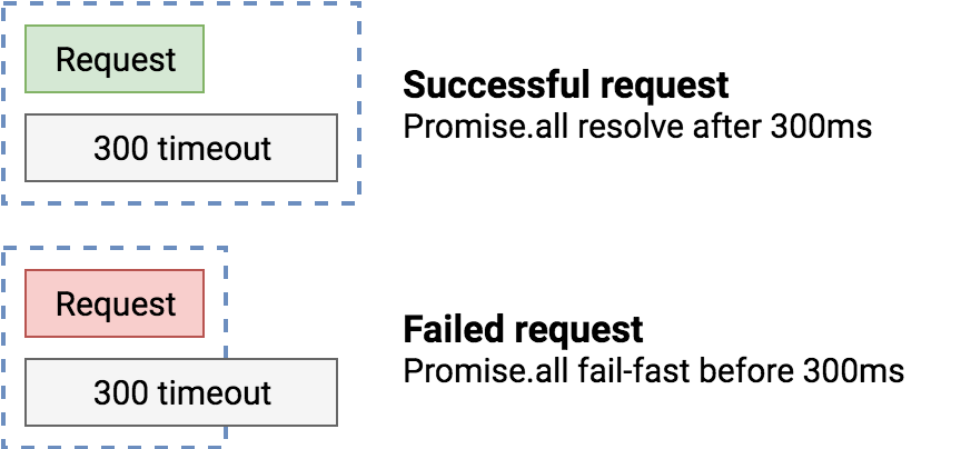
To fix this we will wrap our axios promise in a Promise.all that contains a timer so that, no matter what, we execute for at least 300 milliseconds.

Here is our new submit() method. Note that if no url prop is given, then our real promise is null and therefore the timer will be the only promise used which is the expected behavior.
Promise.all([

    // Real promise.
    this.url ? axios.delete(this.url) : null,

    // Promise ensuring at least 300ms of execution.
    new Promise((resolve, _) => setTimeout(resolve, 300))
])

.then(this.onSuccess).catch(this.onError);
The problem is that this implementation doesn't work when the request is failing. This is due to the fail-fast ability of Promise.all. Basically, Promise.all waits until all given promises have resolved to resolve but as soon as one of them fails, it will fail instantly.

There doesn't seem to be any glamorous way of fixing this issue. The approach will we take is to ensure the request promise never fails but returns an Error object instead. Then instead of defining a catch callback, we check whether the request promise resolved in an error.
Promise.all([

    // Real promise.
    this.url ? axios.delete(this.url).catch(_ => new Error) : null,

    // Promise ensuring at least 300ms of execution.
    new Promise((resolve, _) => setTimeout(resolve, 300))
])

// Succeeds or fails based on axios's return value only.
.then(([value]) => value instanceof Error ? this.onError() : this.onSuccess());
Conclusion
I often find myself trying new ways to improve both user experience and my own experience as a developer. This blog will act as some kind of laboratory notebook. Thus, if you also find that interesting feel free to share your thoughts and contribute to the lab.
Back to our delete component, I think it provides a nice starting point that I could leverage in my applications. I am not trying to create a application-agnostic component that will be pulled out of a package. I have tried that enough to realize my apps will always try to hack it in some ways. What I'm trying to do here is to create some goodies that I can copy/paste/modify into my projects. That's my sweet spot.